
Toledo Cafe
Re-branding
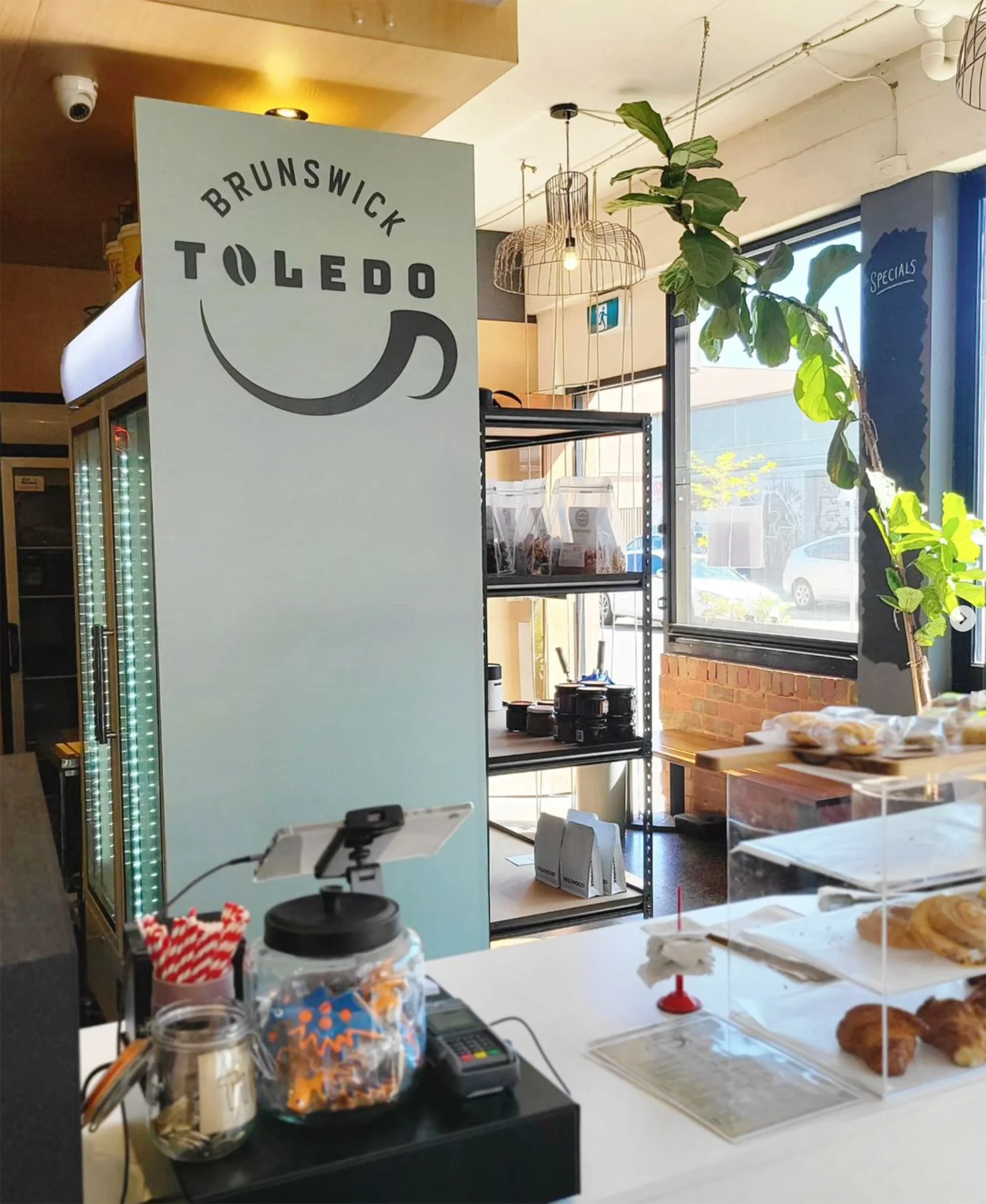
Working with another graphic designer, we re-designed the logo for a local cafe in Brunswick called Toledo.
Logo and Application
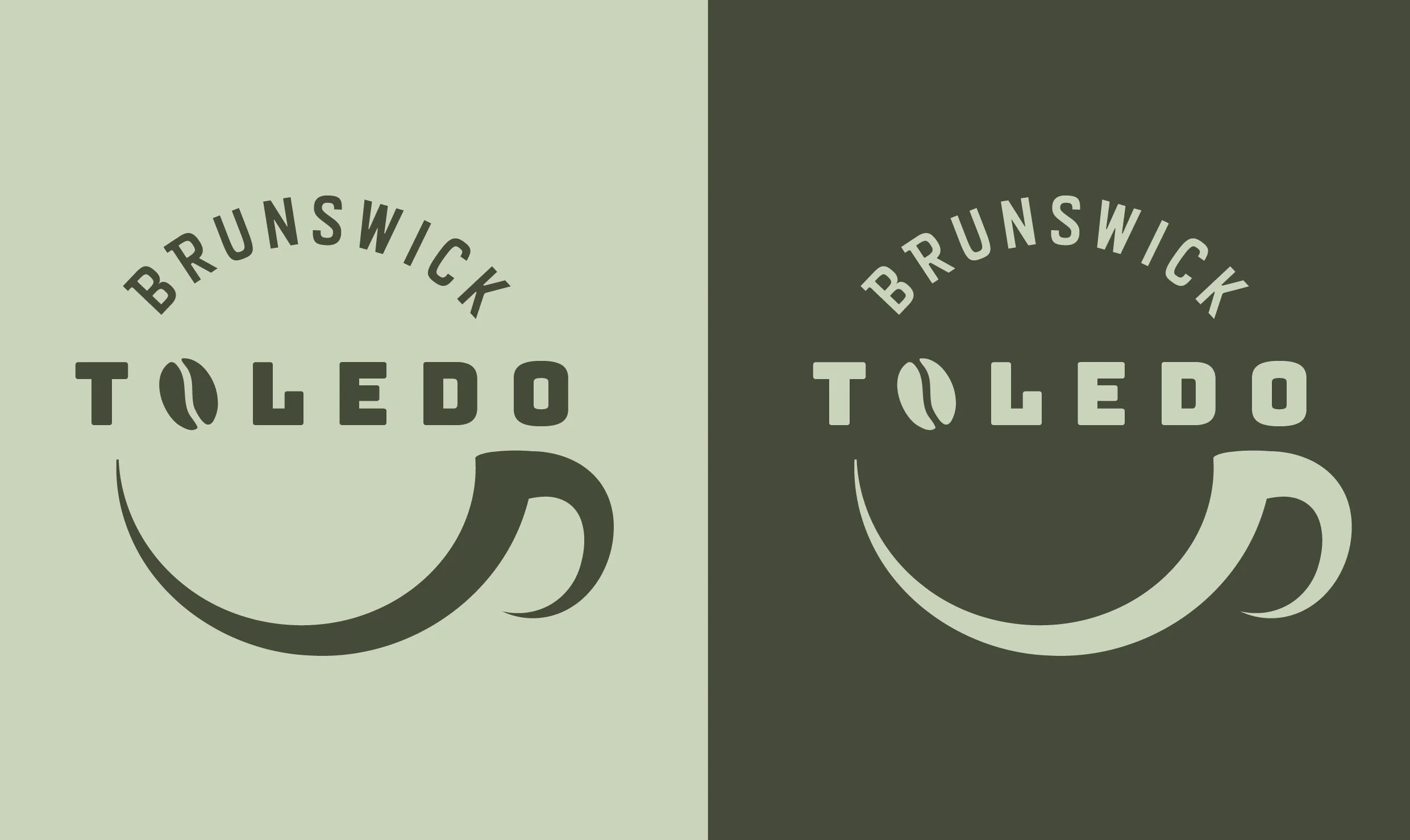
The client had a specific idea for the logo that involved their cafe’s name above a coffee cup. Multiple stroke variations for the coffee cup were sent to the client until they decided on one with a thin to thick line.

Originally, the client wanted ‘Brunswick’ to be the centre of the logo, however, after trialing this we suggested to the client that it would be benifitial to have Toledo be the focus of the logo in the centre, to which the client agreed. We also replaced the O in ‘Toledo’ as a coffee bean which ended up working well.